
It is often said that we cannot convey half of the thought we would like to in words, but in the product package we can tell the other half of the message by using the design. Especially when looking at product packages from overseas, the problem”I do not know the contents written on the package” gives us the opportunity to focus on design motifs and balance.
The possibilities and interestingness of the design suddenly come to light at such times.
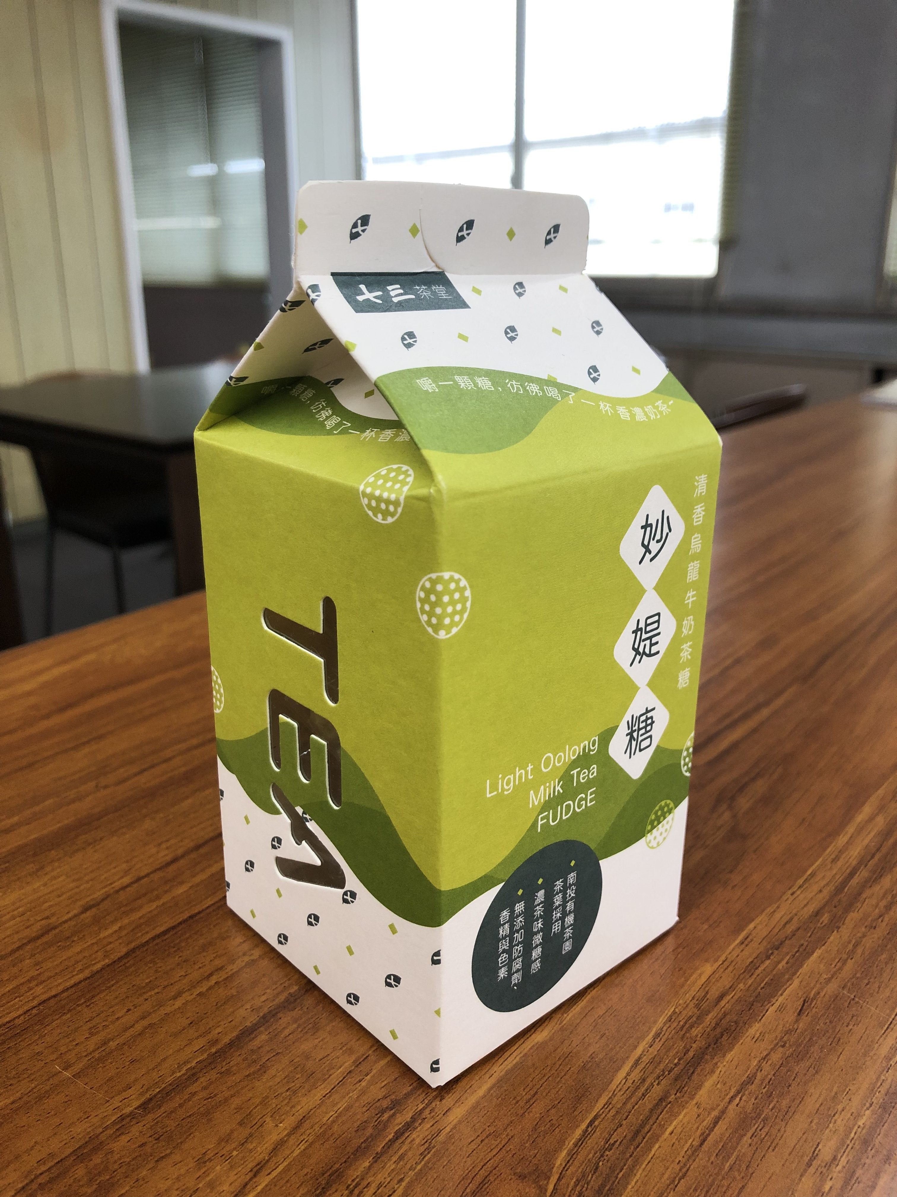
This product I purchased in Taiwan. If you could read English, you can catch it is a soft candy with milk oolong tea flavor, but you might be confused by its volume come up from motif .
The colors used in the package are white, light green, a little dark green, dark green, and green like deep blue, yes, I felt the passion of the designer for green color.
In Japan, oolong tea is generally associated with brown drinks in plastic bottles, but in Taiwan, there is a tea culture which tea leaves are washed first in hot water and then poured from a teapot to cup, so it is green color to be associated with oolong tea.
With these differences of culture, it is one of the fun things that we observe overseas package design, that also we can know our own culture again.
At the center of the paper pack, several green paints are placed as a background of the package, gradually offset like waves.
It reminds me that the liquid, which is the content is not really present, is swayed as the liquid. It brings a sense of stability to the whole package design and, of course, it can properly appeal that this is a product of oolong tea taste.
In addition, the pattern made of the combination of “dark green tea leaves” and “yellow-green diamond” placed on the top and bottom of the paper pack, produces an elegant and lovely design, it is a good trick to tighten the space that seems to be too simple on a white background.
As you can see from the package motif, this product is not a “content” but a design of a premise that we know “material of content”.
Actually, there is another type of soft candy of black tea with milk flavor, which is also not designed as a candy concept, but is designed and packaged with the message same concept of “this is milk and tea.”
Since this product has gone through the process of extracting the motif deep into the “material itself”, it has succeeded in assembling the design with an idea that is not caught by the finished product.
A great design that has gained new possibilities for expression as a result of stopping sticking to the genre as a product.