Even if you don’t touch it, you can imagine its feeling just by looking at it, because there is a memory that we have touched them in our experiences so far.
If the designer can convey the sense of touch visually (if it can be imaged), it succeeds in creating the atmosphere of the place.
The difference between a “wooden house” and a “stone house” made. It is fun just to imagine that the conversations and their life style being in the house are completely different.
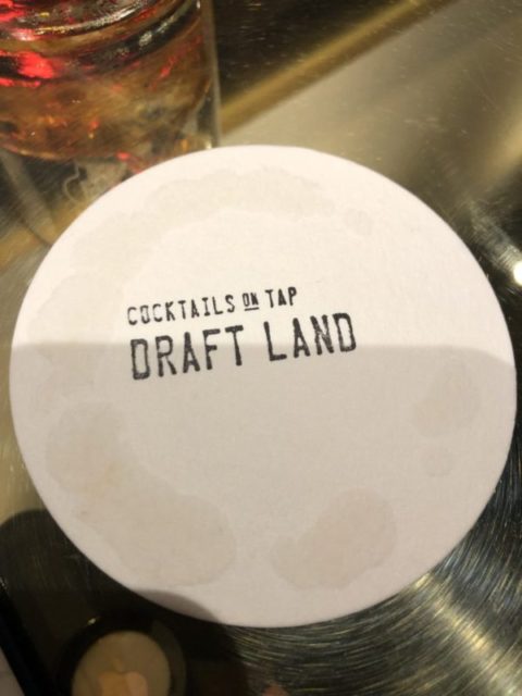
The design of the coaster presented at the bar “DRAFT LAND” in Taiwan is interesting because it is presented within the concept of this bar.
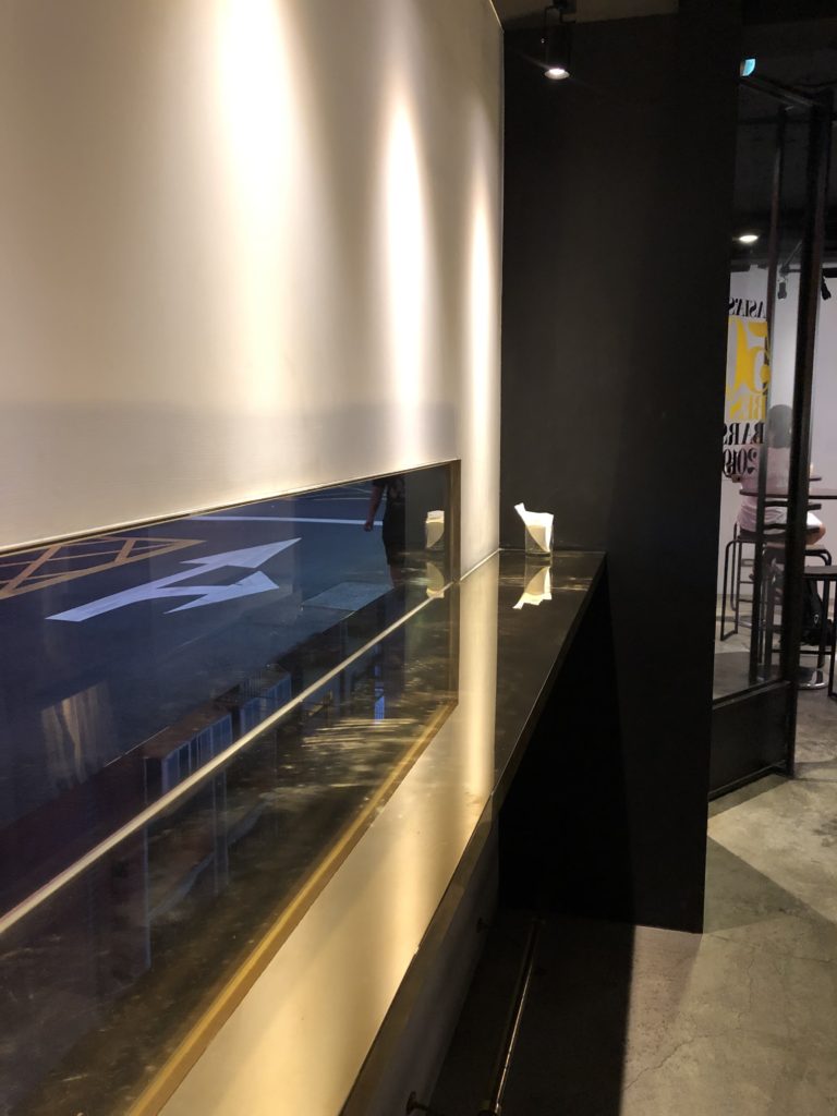
When we opened the door made of iron and glass, the floor was made of concrete, and the counter table was a mirror-finished iron plate.
An acrylic menu board is posted inside the store; the spout of the machine containing the cocktail is made of metal.
And the uniforms like a scientist’s white coat.
When entering here, customers are surrounded by things that image minerals and metals.
The coaster offered at the store is too simple one just stamped with black letters on white paper.
In the dimly lit store, the simple coaster placed at the customer’s hand, is one of the items that photogenic “these colorful cocktails that are pleasing our eye” and makes them stand out.
The letters written on the coaster have letterpress-like fonts and ink blur, in the near-future store like there, bring us a nostalgic vision.
When I touched the coaster to put a cocktail glass, I felt the comfort as neutralized between the hard environment I’m looking at now (image of the store) and the soft touch I’m now touching.
The soft touch and blurry font that I touched in the store where designed as concept of cool and hard, and the moment of relaxation that is brewed from its tenderness, make our conversations and thoughts better.
A great design, designed in terms of texture and properly placed in a conceptual environment.


