As we walk a city, packages that suddenly appear in the landscape are usually not beautiful, is disappointed to see the trash thrown away in the plants or on the streets. However, before making these judgments on good or bad, let consider the motif of package design.
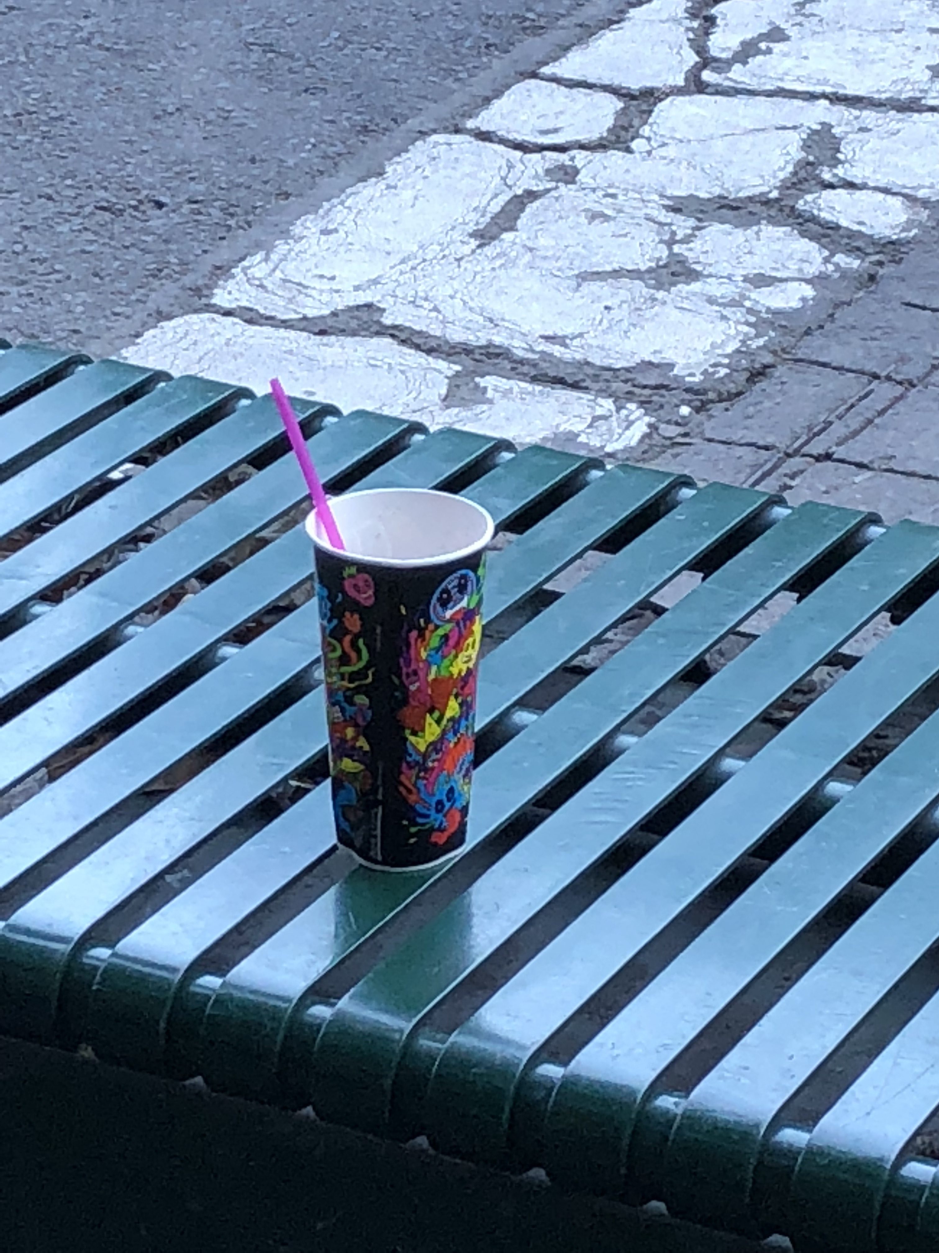
In Australia, I took a photo of this paper cup which has interesting color, caught my eyes.
The first thing is the black color used for the background. The brand name SLURPEE’s logo and the company Seven Eleven’s logo (not visible in the photo) are unified in black.
By using 10 or more colors on a black background and drawing a graphic which reminds of street art on us, it seems that product name, CIs of Seven-Eleven and pictures complement each other’s attraction.
The cup design is made originally for each country and region, but only the font of SLURPEE is unified. There are seven types of cup designs including black one, and all type is colorful, pop and artistic in Australia market.
A distinctive feature of SLURPEE’s design policy is that they ask to design the original cup to local design company where actually sell the product.
Of cause it because the content itself is simple (frozen carbonated drink), but also they want to differentiate in graphic design by sense of creativeness of the people living there when developing products overseas.
Like the picture P. Gauguin drew in Tahiti, the drawn may have difference depending on the scenery of the land, the thickness of the air, and the intensity of light.
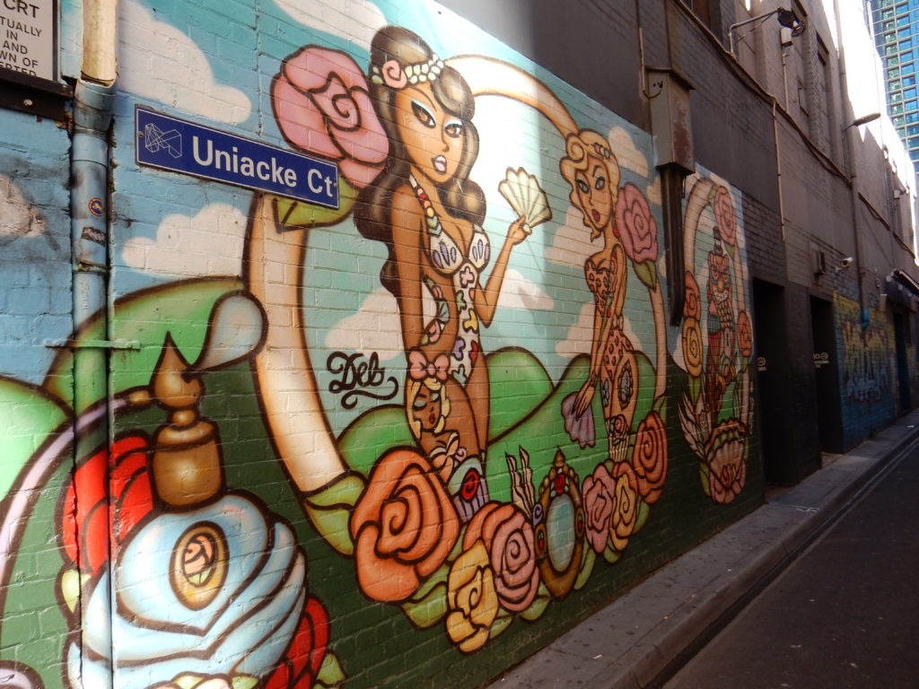
Melbourne, Australia is a city that is also famous for street art, but this package design has a well-arranged design sense related to “places”.
An interesting graphic that came to my attention because it was placed on a bench in the street art town.
画像