
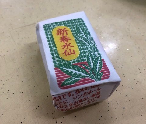
First of all, I would like to applause the designer’s spirit of “I will use only 3 colors!”.
The descriptions of manufacturing companies and products on the side of the package are also printed in red, so if you cannot read the written word, you may think these words are displayed as a caution.
(the contents are tea leaves).
Even though designer use limited number of colors, the layout balance of the “tea leaf picture” and the “brand name” dynamically drawn only the limited angle of view was wonderful.
Coloring of “border” and “check” of the package background is also good.
Because the color of the picture and the product name is well contrasted, the impact of the package is huge but it suits well.
And I think that the excellent point of this package is in the texture (touch) obtained by not emphasizing preservation.
This simple package, just wrapped tea leaves with paper, reminds me again of the fact that tea leaves are so soft and light. It makes me feel and imagine how many cups of tea can be used as a drink, and if you drink it I will feel exhilarating.
I can imagine that it is not too much as a drink, and if you drink it you will feel exhilarating.
In Singapore, people loves drinking “tea”, enjoy it and the culture flows in the air as part of their life.
It is the best simple package design that will teach me such wonderful culture.

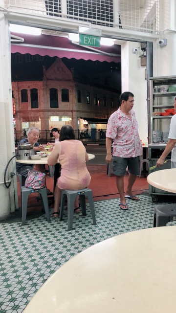
I saw the package at this restaurant.

Even if I plan to eat something unusual or unique before I leave Japan, I always eat the famous ones listed in the guidebook.Spare rib soup.
Soup has spicy & clean taste.
It is also delicious to eat by dipping the meat in a soy sauce-like sauce added with pepper.

The hot water used for tea is helped yourself and is boiled with charcoal fire.
It is hot when you are nearby.